American
Eye CenterA clearer path
to care.
A patient-focused homepage that brings eye-care services, specialist information, and the next step toward a consultation into one considered experience.
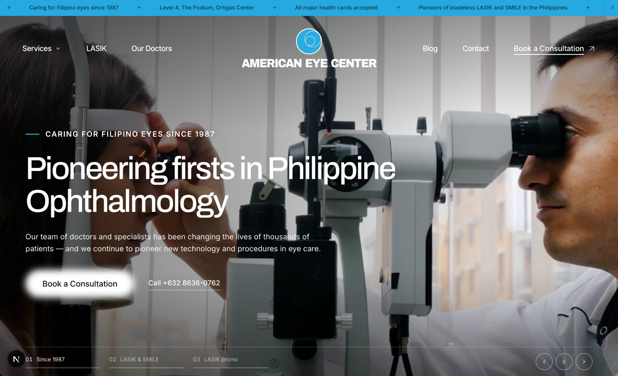
Desktop design preview from the project. Imagery is illustrative.
Help people find
their next step.
A healthcare homepage needs to introduce the practice, help visitors navigate services, and make it clear how to get in touch. This concept brings those tasks together in a single, mobile-friendly journey.
The design pairs a cinematic introduction with a structured service catalogue and consultation calls to action, giving visitors several ways to explore the care available.
A distinctive first impression.
A rotating, video-led hero introduces the practice and featured services. Navigation, direct phone links, and consultation calls to action keep the next step visible.
Care that is easier to explore.
Nine subspecialties are organised into a visual service section. An interactive LASIK guide supports dragging, keyboard range controls, and stage buttons.
A fuller picture of the practice.
Specialist browsing, clinic information, patient-story layouts, and recent-post previews give the homepage an editorial rhythm. Illustrative portraits and placeholder content are identified in the source.
A clear consultation flow.
The form covers contact details, service of interest, preferred date, HMO selection, and consent. Local validation highlights errors and directs focus to the first field that needs attention.
Designed for
the way people browse.
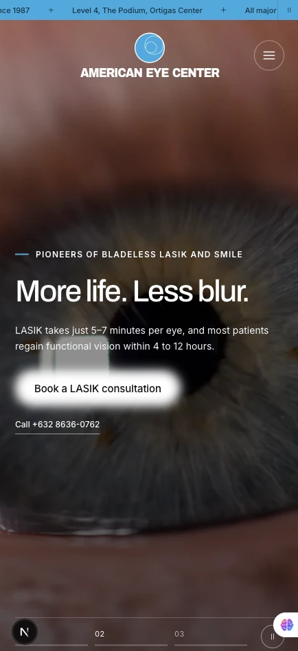
The mobile design reworks navigation and content hierarchy for a narrower screen while keeping the consultation action prominent.
Motion controls let visitors pause continuous animation. Reduced-motion preferences stop auto-advancing sections and reveal entrance content immediately.
Content and interaction,
thoughtfully connected.
The homepage is built with Next.js, TypeScript, Tailwind CSS, and Motion. Interactive features are separated into focused components for the hero, services, specialists, and consultation form.
Page copy, service descriptions, contact details, and image references are gathered into a shared content file. Brand styles and responsive behaviour sit in a central stylesheet.
A complete homepage concept.
A tangible direction for the website.
The project contains a working responsive homepage and desktop and mobile visual previews. This case study presents that design and implementation; it does not claim a production launch or measured patient-conversion results.
The consultation form is a demonstration: it sends no information and books no appointments. Future-page controls show a coming-soon state in the preview.